
Overview
Project summary
The relaunch of YP consisted of several tracks. In addition to a UX and visual audit for the initial pitch, I led the interaction design and research for the mobile web and iOS relaunch. A parallel team took our findings and expanded the design to the website. Individual contributions included:
primary and secondary research, including needfinding, concept validation, and usability testing
alignment and ideation session planning and facilitation
concept generation, workflows, and wireframes
prototyping
Role: Senior Interaction Designer
Led interaction design, user research, and prototyping
Worked closely with internal YP usability testing department
Mentored Jr. Interaction Designer
Team: me, Creative Director, Program Manager, Principal Visual Designer, Sr. Strategist, Jr. Interaction Designer, and a Design Technologist
Research and Mobile Web Project Duration – 6 weeks
iOS Project Duration – 7 weeks

Initial Pitch
Using some applicable best practices and design principles, I ran a quick UX and visual audit for the YP pitch to highlight our understanding and expertise in the area as well as low-hanging fruit that could be addressed immediately. The turnaround time was a day or two, I presented the audit in the pitch meeting, and we won the project.
Existing YP app

UX and Visual design Audit
Research
PRIMARY RESEARCH
YP didn't know exactly who they were targeting – nor who they were competing with. Is it Google? Yelp? Zocdoc? To help YP focus, we started with local search. I wrote a research plan and activities for this initial round of need-finding. We selected 6 participants who regularly use their phones to search for businesses on the go and had them work through interview questions, search habits, a scenario walkthrough, and a brand association exercise.
I also led the synthesis. An example insight is shown below. These sets of needs helped us better focus YP's vision. They had huge files worth of market research but could not quite tie that into features and strategy that would bank on what they already have while also supporting their primary advertisers. Through our research phase and ideation workshop we were able to create that feature set and strategy with YP.
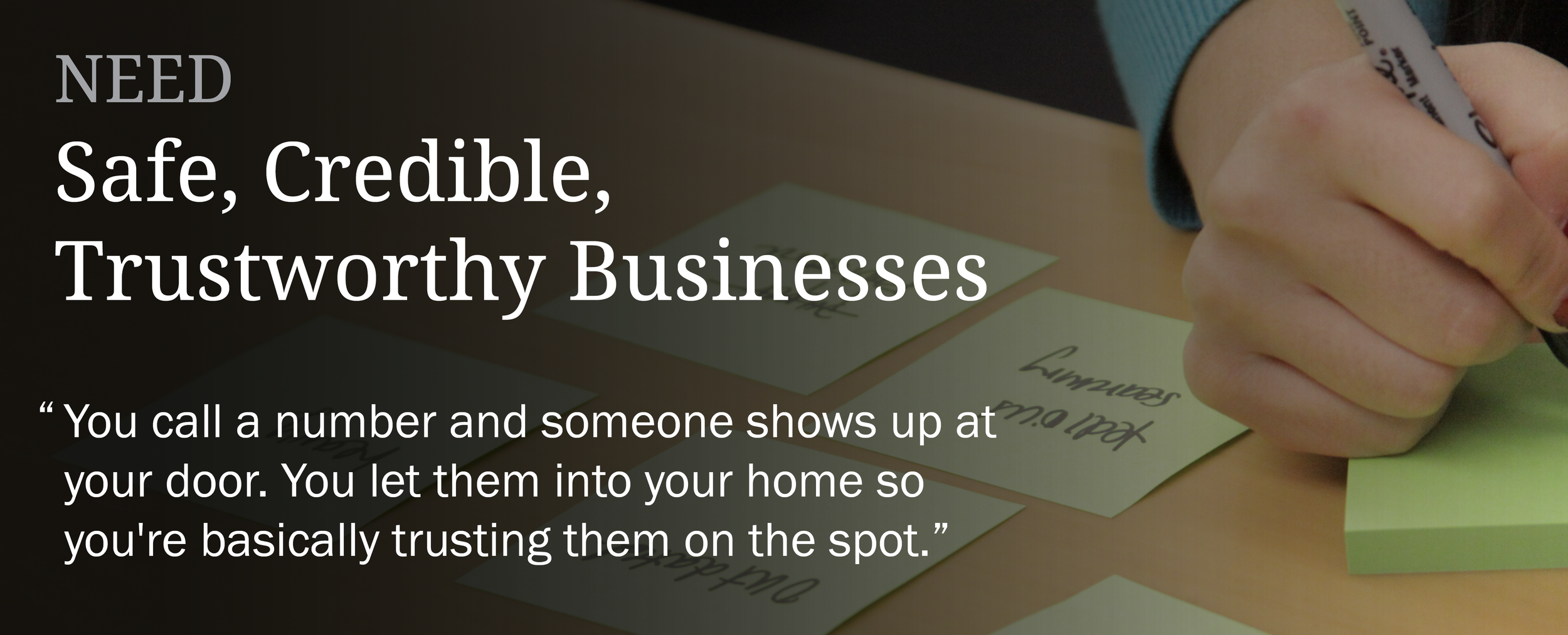
We found our participants to be wary of fraud, identity theft, and crime on the internet. They used various methods of validating the credibility of a potential business – specifically ones that would be entering their homes – including cross-referencing phone numbers through different search engines, checking photos, and talking with friends or neighbors.
Competitive Feature Analysis
Led by our strategist, the team established a framework for YP to better understand the landscape of competition. Within this framework, I performed a competitive feature analysis across dozens of businesses and their cross-platform offerings. I determined table stakes in each area, as well as highlighting gaps in the competition that could be areas of differentiation for YP.

Initial Wireflows
I was responsible for creating three hero flows that highlighted different approaches to YP's refined product strategy. While I did this initial work in Illustrator, because we knew we'd want to test with a prototype, I moved the team to Axure and all flows for both mobile web and iOS were reviewed live.

Prototype and Documentation
To avoid privacy concerns, the iOS prototype is available for download only. Also, even though we had a working prototype, we still wanted to thoroughly document some of the trickier interactions for the iOS app so I also created an in-depth interaction guide that discussed how each part of the system should work.
Final Design
I was responsible for the wireframes and prototype and the Principal Visual Designer was responsible for the visual design.


